

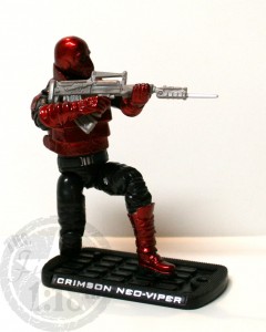
 So far, one of the biggest improvements with the Rise of Cobra line of figures over the 25th/Modern-era figures has been the great build quality and improvement in articulation.
The Crimson Neo-Viper takes a bit of a side-step in that regard. The articulation for the figure is not BAD, but it is not nearly as great as the recent Elite-Viper either.
On the positive side, the figure can still do the “take a knee” position relatively well, which is always a big plus in my book. The fact that the figure can do it with, or without a stand is even better. The legs have lots of articulation, from the feet all the way to the waist, no real problems there.
The problems I have are mainly with the upper body sculpts, and effect this figure as well as the “Attack on the PIT” Neo-Viper as they share the same sculpt.
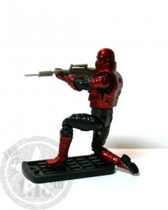 First, the arm joints cannot do a straight 90° angle, it’s closer to 110°, and this matters because it makes it nearly impossible for the figure to hold a gun with one hand and support the rifle with the other. You can see in the images I had to twist the gun and use some bending chicanery to get the photo to look correct.
Secondly, the huge (and removable!) armored vest seriously impedes the already limited arm articulation. The vest is so bulky that the figure cannot reach across his chest to touch his hands together. Think of a bodybuilder who got a few too many muscles.
These issues really make it hard to recommend the figure, as holding a gun properly is a pretty important feature that I expect my action-figures to be able to do properly. Luckily, the armored vest is easily removed, but by removing it, you remove much of what makes the Crimson Neo-Viper different than the other Neo-Vipers.

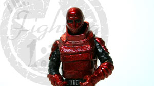
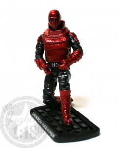 The overall paint on the Crimson Neo-Viper is well done. Surprisingly, I felt that Hasbro did a good job with a bright red character, somehow they kept the color dominant without looking TOO garish.
The colors are all very uniformly applied, and they manage to show off the sculpting details very well through the paint.
This figure is definitely more glossy than others, but for his color-scheme I feel it works just fine.
 The Fighting 1:18th! The best Military 1:18 scale site on the net!

![[REVIEW] Acid Rain World Raptor MK1 [REVIEW] Acid Rain World Raptor MK1](https://www.fighting118th.com/wp-content/uploads/2014/08/Acid_Rain_Raptor_Banner-272x125.jpg)
I was going through the gi joe figures with my son this evening and i got to looking at this figure close up. I never paid it much attention when he first bought them. After i looked at it comparatively with the original neo-viper i liked this version much better.
Some simple thing they did to spruce this version up was actually paint the shoulder pauldrons. The original neo-viper’s were plain black like the rest of the sleeve. The cobra logo was also tampo printed on the side of the shoulder pauldron rather than on the front of the sleeve. For some reason Hasbro gets a hard one from printing the insignias on the front of the arms rather than the sides of the arm like they would be in real life.
The red is just awesome. On this figure. Not a color or style i would choose if this figure were based on real life, but the red metalized look is just incredible.