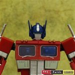
There is a lot to like with certain details of that 3.0 mold, will be interesting to see it in color. Sure hope the trailer is not included, but let’s not kid ourselves, I’ll be waiting the extra 6 months for the KO. Never once have I picked up my KO Megs and thought “this is a KO”.
Takara Transformers
- Thread starter Bravestarr
- Start date
You are using an out of date browser. It may not display this or other websites correctly.
You should upgrade or use an alternative browser.
You should upgrade or use an alternative browser.
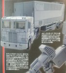
Alt mode looks great. But that bot mode. What is it with them and super short torsos?? The Urkle look is not becoming...IMO.
They finally completed the coneheads, so I bet they are scribbling furiously to reset that 6 piece money pot.
Alt mode looks great. But that bot mode. What is it with them and super short torsos?? The Urkle look is not becoming...IMO.
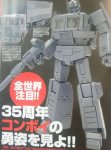
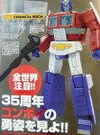
This pic made me go limp now that I’m seeing it head-on... Full on diaper crotch, not just so-so like you’ve called out on every MP since Ironhide. It’s as if TT accepted your challenge. Also, when did Op ever have a square grill in the animation? Nothing from the windows to the thighs look anything like him to me.

I don't know how I feel about that. It's definitely toony. It doesn't look terrible, but it's not the badass figure I was hoping for. He's got a bit of that high-waist, Urkel-pants that MP-36 has going on. I'm torn. I want to like it, but I'm far from blown away. F#$% that's a big diaper. Ugh.
Hopefully the colored version changes the way we look at it, but as it stands it looks like his belt is on 3 notches too tight. The seam down the leg and what looks to be flat shin vents just look bad.
Have you guys looked at the reaction in the official thread at TFW? I'm assuming those guys look like this?


Have you guys looked at the reaction in the official thread at TFW? I'm assuming those guys look like this?

It’s the usual where half the crowd thinks it’s the greatest thing ever and are telling others why they are not allowed to criticize it with so few pics to go by.
Yeah, I looked in there last night, and it was a dumpster fire of of argumentative know-it-alls and TT fanboys. I wanted no part of it.


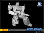
Neither one seems to capture the toon look perfectly, but I'm liking the look of the MS version. Very powerful looking. Not that I'm interesting in a purchase, but it does look good.
I like the MS-01 better, but not enough to swap out my MP-10. TT nailed copying that line art which is a shame since Prime just doesn’t look like that in the toon or ‘86 movie. I’m kinda relieved since I don’t want to spend the money.
I still think that photo is skewed though considering the pic of the prototype on the table makes him look more proportionate.
I still think that photo is skewed though considering the pic of the prototype on the table makes him look more proportionate.
I'm not a huge fan of MP-10, so I've been actively looking for an alternative for a long time. The new MP once again took the worst parts of the cartoon rendering and put them in the design. Prime's torso was never meant to be that short, but he was normally drawn from the perspective of humans or shorter bots, an effective foreshortening that made the torso look smaller from down below. Same for Megs. To design stumpy torsos on purpose completely misses the point...
The MS figure looks ok, and that might be the direction I end up going - they need to narrow that thigh gap a bit and he'd look 100% better. He's a little stocky, but it might end up the best of the bunch. Honestly, I just wish someone would make an MP2.0 scale version of MP-01. I have my original 20th Prime and Faith Leader... I just need one scaled in between with the awesome igear head, and that would be perfect for me. He might not have 2018 articulation, but he's got enough and still looks the best of them all.
The MS figure looks ok, and that might be the direction I end up going - they need to narrow that thigh gap a bit and he'd look 100% better. He's a little stocky, but it might end up the best of the bunch. Honestly, I just wish someone would make an MP2.0 scale version of MP-01. I have my original 20th Prime and Faith Leader... I just need one scaled in between with the awesome igear head, and that would be perfect for me. He might not have 2018 articulation, but he's got enough and still looks the best of them all.
Short torso Megs is perfectly acceptable considering he's a freakin gun and his bot carries over that top heavy aesthetic well, but jesus Prime... You are a freaking semi! They have actually made his entire torso shorter than the front of the the cab. I really hope it's a bad photo perspective thing going on because I'd love to have an Ops that matches Megs in articulation and style.
To design stumpy torsos on purpose completely misses the point...
Boom. And that's true for a lot of other "accuracies" that people insist on. They're holding their collectibles and TT to an exaggerated or subpar standard. I mean, why not also insist on cell shaded finishes? I've even seen people argue in favor of animation errors...

The MS figure looks ok, and that might be the direction I end up going - they need to narrow that thigh gap a bit and he'd look 100% better...
I wonder if they added that little blue dick nub the animation model has if that would help or hinder.
The only major concern I have about the MS figure is the singular waist flap. I've seen some artwork that the figure is supposedly based on, and the singular flap looks pretty bad in action poses, like he's sporting wood under there. I hope the figure isn't going that direction, but I might even be willing to mod it myself if that's the only issue.
Again, slavish adherence is the issue. 
I'm not sure why someone hasn't just come along and created a non-transforming line that's similar to that poseable Devastator that's animation accurate. Maybe they wouldn't sell buckets of them, but being the only one doing a line like that, they'd have a monopoly.


I'm not sure why someone hasn't just come along and created a non-transforming line that's similar to that poseable Devastator that's animation accurate. Maybe they wouldn't sell buckets of them, but being the only one doing a line like that, they'd have a monopoly.

I have that devastator, and I absolutely love it. It's a fantastically fun figure. But part of that love is that it doesn't try to be anything except exactly what it is, an overly toony, nicely articulated action master. It looks great with my toony pat-lee-styled revoltech figures (who also don't transform). I would totally go for that kind of *playable* G1 line.
But I don't want it in my MP figures. WTF Mattel?!
But I don't want it in my MP figures. WTF Mattel?!
Haha. Not in the current MP line. But a new fully fleshed out MP line similar to DCUC or MOTUC.
Watched that T&R Hova video again and can’t get over how far the chest sticks out from the torso. With the re-release of Downbeat, I’ve asked tf-direct to roll my preorder over to him. Fingers crossed. I just don’t want to gamble on hating the quality and looks of my last Geewun MP purchase.
Properly stickered-up, Downbeat is pretty spot-on looks-wise. I don't particularly like how his chest tabs together, but for a display piece, it's not a big deal. If you're going to transform him regularly/frequently, I could see that being a bit annoying. But Downbeat is pretty good overall. If you hate him, he'll be easy enough to sell.
I refuse to sticker any of mine up besides insignias. DB looks fine in bot mode without, so I’ll just leave him that way. The mixed stripes on the car is awful.
Stickers are one of the huge reasons I left Lego for Megabloks. Tampo that shit people!
Stickers are one of the huge reasons I left Lego for Megabloks. Tampo that shit people!
Yeah, it's got a lot of good features, but the uber-short torso with square truck grill (SMH) really ruins it, IMO. When protos come out and we see this thing side-by-side with MP10, the new one's high belt-line will be even more obviously awkward.
Fuck TT and their disturbing inability to properly understand 2-D forced perspective.
Fuck TT and their disturbing inability to properly understand 2-D forced perspective.
They seem to be Urkling all of their MPs lately. I guess put them on a high shelf and that'll fix it? Or would that only exacerbate the problem? Yeah, it would.
You guys and the guys at TFW must be WAY bigger TF fans than I am because the only time I ever realize a headsculpt is wonky/wrong is when the sculptor sucks at doing faces. And not because the face doesn't look like the character, but because it just looks bad in general. As far as I know, that OP head looks identical to every other OP head I've seen. And they all look identical to the toon/toy. I'd need side-by-sides to know otherwise. 

You guys and the guys at TFW must be WAY bigger TF fans than I am because the only time I ever realize a headsculpt is wonky/wrong is when the sculptor sucks at doing faces. And not because the face doesn't look like the character, but because it just looks bad in general. As far as I know, that OP head looks identical to every other OP head I've seen. And they all look identical to the toon/toy. I'd need side-by-sides to know otherwise.
Here ya go Ed, mp-10 is the perfect toy head and 35th is the best anime head I have seen.
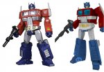
The new TT head looks like old-man prime, as it's basically the same design as one of the DaCa toys heads (left) for MP10. I'm definitely more interested in the MS figure. It hits all the right buttons for me in both the looks and proportions departments. If not for the thigh-gap, it would be damn near perfect.
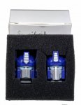

Oh wow. That head, some rounded hands and a real gun might make me completely forget about this 3.0 nonsense. The toy head is the main reason mp-10 clashes with Megs 2.0.
Can’t find any heads beyond Shadow Fisher’s kit, so I settled for a pair of KFC hands with a proper gun.
If you need a DaCa head, I might have one. I'm 99% sure I bought that set, but my MP-10 still has the stock head. I'll have to check my bins.
That igear head looks awesome. Its got kind of a Robotech/anime/gungan(?) look to it that I don't normally find appealing. Applied to OP it looks outstanding.
But yeah, side-by-side the differences in heads are very obvious. Also noticeable s-b-s is just how terrible that stumpy torso is on new TT Prime. Yikes! It also highlights how not-toony (duh) MP-01 is, but at least he's not wearing geezer trousers.
I can see that MS prime having a place on a shelf as a stand alone. But he is just way too toony to fit into the MP collection I have built. MP-01 still fits in perfectly.
